In Amsterdam we visited a range of professionals, including printmakers Thomas Gravemaker of Letterpress Amsterdam and the Grafik Werkcentrum. We learned a lot from simply talking to them. Thomas described how he loved the way a printing press "clunks". Many people we spoke to said how they enjoy the sounds of printing presses and decided this was a strong concept for our identity.


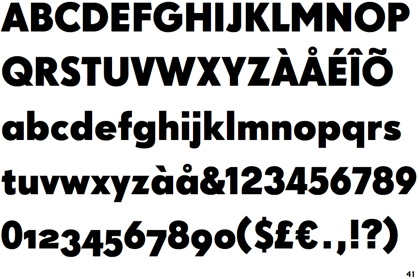
We managed got to use GWA's printing presses and printed the word 'Clunk' in a selection of typefaces. This formed the new identity, chosing a logo that was impactful and timeless. The font we chose is Super Grotesk
On our return we refined the manifesto with a much clearer image of what we were after:
There is still, and always will be, a value in print. There is no need for exclusivity, we will lead the discussion and strip print of it’s stigma.

No comments:
Post a Comment