This was the first large scale collaboration with fellow Graphic Design students. We were all pushing for a professional approach to the work but working alongside three very different designers with strong voices proved a challenge at times. This brief undertook a huge development, and a bit of a moral blow, but quickly got back up. This experience, however, was new for us all and it strengthened our approach to problems and working as a team.
We definitely got ahead of ourselves and needed to slow down. We went to Amsterdam and let things naturally inform the collective, taking things as they came and not rushing into decisions. Our new experience let us reconsider jumping into a decision when over excited.
It is a strong concept and idea and we let our experiences and knowledge learnt from others inform it. We took in a lot of knowledge from older professionals and let our experience in Amsterdam inform the final identity. What we learnt in Amsterdam will also affect the content of our publication, as well as be the content of the publication. The brand identity is a strong, impactful identity, and a decent idea behind it. However, there is still more work to do to continue this project after university, and there is a lot more material to work on.
For this brief, we ran out of time because of bad time management. We intended to complete our publication by the end of the year but that became hard to achieve. As a group we all had something slightly different in mind, which caused problems, however now that our idea is far more solidified, we feel more confident and I am looking forward to how it grows. Our successful international trip, with more possibly lined up, increased our professional networking skill and has grown our network.
Sunday, 13 May 2018
OUGD603 - Brief 08 - Publication Content
The main platform for or collective was always going to be a publication. Now that we have gathered material after our trip to Amsterdam, we can include the conversations we have had with other printmakers and designers, including:
- Thomas Gravemaker of Letterpress Amsterdam
- Florence, Coreen and the team at GWA
- Wendy Richardson (art director), Sandra Nicolas (art director) and Lee Boulton (writer) of 72&Sunny
- Armina Ghazaryan of Letterpress Corner
The publication will be illustrated with images of the studio spaces we visit, the process of our recent projects, artwork from those we interview, and features from both professional and amateur creatives.


Clunk’s publication will also focus on the disasters and successes of print, encourage it’s readers to get involved with print on social media, and give an in depth look at print festivals and workshops across the world.
The publication has to be traditionally produced, and can be done by local printers such as The Print Project or Incline Press.
Stocked in stores such as Colours May Vary, Village or Magma.

To fund the project, we can find sponsors such as GF Smith, Its Nice That, or use tools such as crowd- funding. It can also be funded by adverts for print stores.
To promote the publication we will take part in Glug talks and visit as many Design festivals as possible.
To promote the publication we will take part in Glug talks and visit as many Design festivals as possible.
OUGD603 - Brief 08 - Feedback & Amsterdam Influence
After we had started bringing together material, we received some feedback on the collective. We were effectively told to start again. The collective seemed to be trying to be too many things, and it's concept wasn't strong enough. So we decided to go to Amsterdam with a fresh mind and let that trip inform our collective.
In Amsterdam we visited a range of professionals, including printmakers Thomas Gravemaker of Letterpress Amsterdam and the Grafik Werkcentrum. We learned a lot from simply talking to them. Thomas described how he loved the way a printing press "clunks". Many people we spoke to said how they enjoy the sounds of printing presses and decided this was a strong concept for our identity.


There is still, and always will be, a value in print. There is no need for exclusivity, we will lead the discussion and strip print of it’s stigma.

In Amsterdam we visited a range of professionals, including printmakers Thomas Gravemaker of Letterpress Amsterdam and the Grafik Werkcentrum. We learned a lot from simply talking to them. Thomas described how he loved the way a printing press "clunks". Many people we spoke to said how they enjoy the sounds of printing presses and decided this was a strong concept for our identity.


We managed got to use GWA's printing presses and printed the word 'Clunk' in a selection of typefaces. This formed the new identity, chosing a logo that was impactful and timeless. The font we chose is Super Grotesk
On our return we refined the manifesto with a much clearer image of what we were after:
There is still, and always will be, a value in print. There is no need for exclusivity, we will lead the discussion and strip print of it’s stigma.

OUGD603 - Brief 08 - Refining Collective Identity
After taking part in the second year collective activity, we were keen to continue this project and keep the core values going. We met to remind our identity and manifesto in the lead up to our Amsterdam trip.


After brainstorming we worked together to develop a logo for the collective. The collective still pushed its passion for print, and targeting students by channelling the pub culture.

Manifesto:
PUB is open minded.
Conversation is our drive.
We want to talk to you.
Print was never dead.
Print is prominent.
Print has no limits.
Print is relevant.
PUB will strip away the stigma,
Celebrating print with everyone.
OUGD603 - Brief 08 - Clunk
Brief
Form a collective that runs a platform promoting how valuable traditional print methods still are, and that challenges the “print is dead” mentality. Open the conversation of print and celebrate its relevance in today’s creative industry. Using the collective, create a publication to spread the printed word.
Background / considerations (contextual features of the brief - personality, history, style, etc.)
Consider the most engaging way to promote the collectives manifesto to a creative target audience, both professional practitioners and enthusiasts. It is important to open the conversation of traditional print to anyone who is interested with both the visual and written content.
Communicate with studios, printers and professionals who still produce using traditional print methods within industry. Look at promoting their work, using this as an example to reinforce the manifesto. Conversation should not be limited to just practitioners.
The collectives manifesto should be communicated through multiple platforms. This could include, and not be limited to; an online presence, printed and digital advertising, public speaking events and networking.
Content should not be structured by themes, as conversations naturally flow, change direction etc. Content, particularly of the print publication, should flow like a conversation. The design should be approachable, celebratory and clear to understand.
Consider the potential of the collective, it could be a brand, studio, archive.
Deliverables (what items are to be designed/made)
A valuable platform with distinction and status that will continue to work as an ongoing project. A manifesto and guideline to ensure consistency throughout the collective.
Interviews with creatives, discovering their thoughts on print.
Discussion around traditional print being accessible to all, for beginner or professional Communicate what was learnt through the process of creating the collective.
Mandatory requirements (essential requirements that must be followed)
A collective
Identity and manifesto
Online presence and promotional material
Saturday, 12 May 2018
OUGD603 - Brief 06 - Evaluation
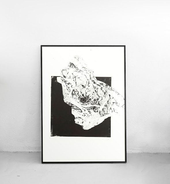
I approached this brief with a determined outlook for the final outcome. This brief resonates with me personally, as well as being a research heavy brief, so I ensured I worked at a high standard, using the appropriate, high quality equipment, large scale scanners and taking my time producing the artwork. I decided to explore mono printing with more freedom. It’s one of my preferred methods of production and decided for this brief to not restrain myself with a specific final outcome and to just create whatever felt right at the time. This method was appropriate as it takes into consideration the research, exploring the positive benefits on the mind of producing arts. I became as creative as I could, producing as many outcomes as possible. Once the artwork was created, the appropriate rules of design were applied, in grids and when applying type.
I was keen to make this brief the most important, as it has a close and personal meaning to me. Being as artistic as I could was appropriate for creating the artwork. The secondary research proved that creating artwork is one of the ways your brain releases dopamine, a chemical that increases mental wellbeing. The research covered serious scientific topics, so the outcome had to be at a high professional standard and be a serious outcome.
This concept is a strong one, with an important meaning behind it. Vinyl is back into popularity and the collectable music is on trend. This product would be successful when on sale. It has also nearly been a year since Chester Bennington’s death, so it is more relevant now than ever. Overall, the final style suits Linkin Park’s brand. All the artworks created are a one off unique, giving them more prominence. Once the artworks were used on the covers, the final designs were finished to a high standard, and appropriately presented in context.
I would have preferred to physically produce the album covers rather than digitally mock them and it would have been good to create more products such as CD covers. I really enjoyed mono printing, as I found it therapeutic proving how effective my research was, proving the creation of artwork is better for mental wellbeing. These have been the most successful album cover designs I have produced, but more time would have allowed me to create even more material.
OUGD603 - Brief 06 - Final Sleeves and Accompanying Poster
Each final sleeve will be sold as a limited edition album cover. They are to be sold as collectables and proceeds going to mental health charities. The one off, unique prints that created the artwork will also be available for sale. This will raise awareness to mental health by generating a buzz around the collectable album covers.


Subscribe to:
Comments (Atom)